Asianati
Asianati is a Greater Cincinnati-based Asian directory that primarily features a local Asian food directory and community stories, with recent integrations of social media feeds and event calendars.
My team completed a wholistic UX research review of the company. The research included a heuristic evaluation, interviews, comparative analysis, usability tests, and then presented the overall findings into concrete design recommendations.
User Interviews
Our team interviewed 5 users to find insights and improve the user experience of Asianati’s visitors.
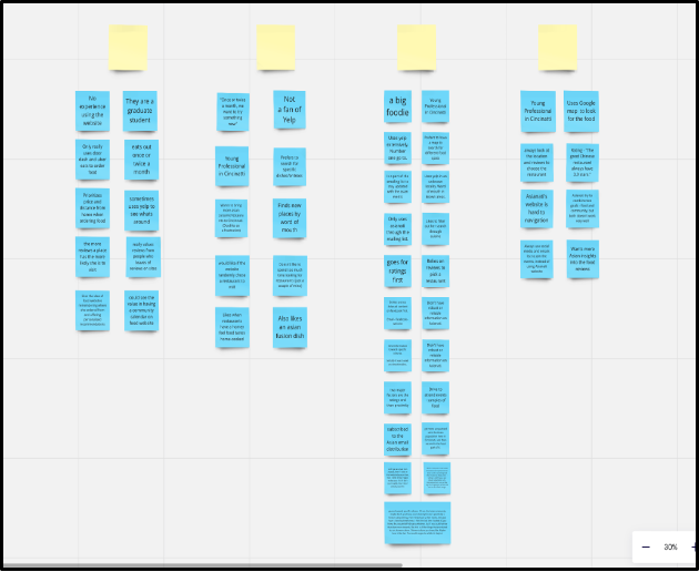
We used an affinity map to organize the findings. Findings were then synthesized into two main findings
01
02
Efficiency is Key!
Users don’t want to spend too much time searching through events or restaurants
Ratings and Reviews
Users are more likely to look at a restaurant with reviews
Heuristic Evaluation
As part of our evaluation process, we conducted a heuristic review of the Asianati website using Nielsen’s 10 Usability Heuristics. This approach allowed us to systematically identify usability issues across key areas of the platform.
Our review revealed 25 unique problems, ranging from inconsistent navigation icons and fonts to unclear food finder icons. Most of these were minor, with only a few requiring significant attention.
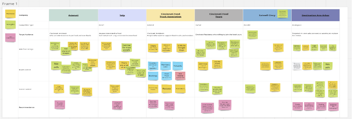
Comparative Analysis
01
More Curated Content
Asianati excels at content that is feels curated. They should lean into creating more curation to differ from its competitors.
02
Restructuring of existing content
Users find the current structure of the website to be slightly confusing. The balance between food and cultural information.
Usability Analysis
Our usability analysis focused on evaluating how users interact with Asianati’s core features, particularly the event participation and restaurant exploration tools.
By conducting usability tests with a diverse group of participants, we uncovered specific challenges and areas for improvement.
01
02
Navigation
Users found it difficult to navigate the food finder due to unclear icons, which slowed their search process.
Positive feedback on the community calendar
Users appreciated how intuitive the community calendar was, demonstrating its potential to serve as a model for improving other features.


